
A React UI library and design system for faster web app development.
Product memo
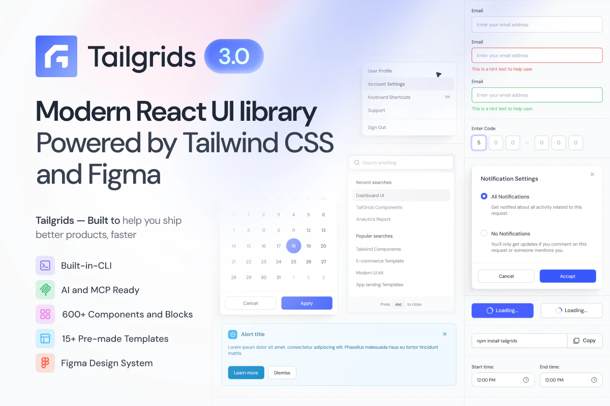
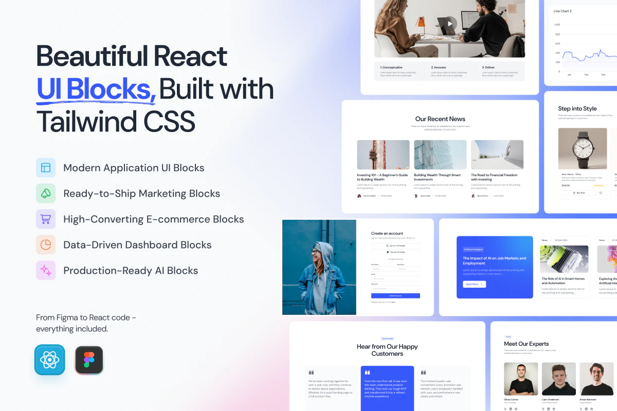
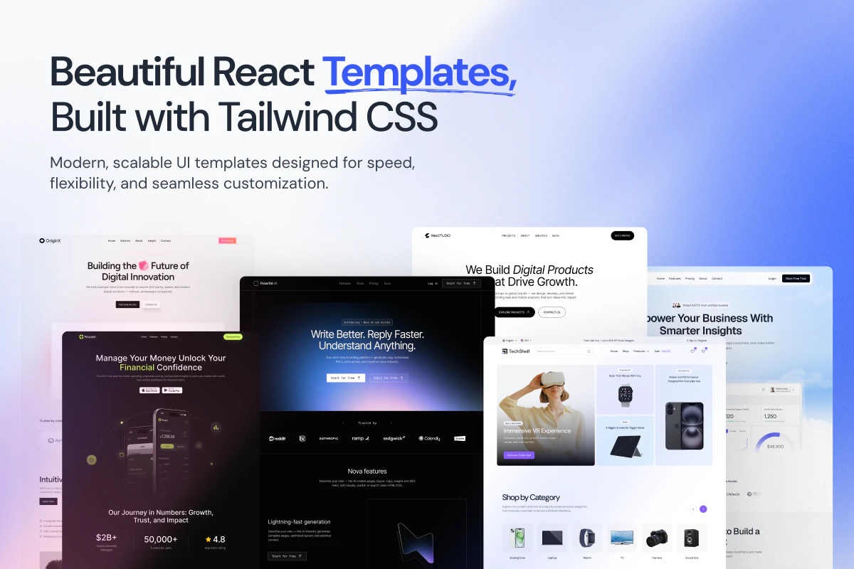
Tailgrids UI provides developers and designers with a broad React component library and a matching Figma design system. It shortens web application development by offering over 600 reusable components, blocks, and templates. This unified approach bridges the gap between design and code, speeding up the creation of various app types, including those for AI workflows.
For who
Developers and designers building React apps
Solves what
Faster development of production-ready web apps with reusable React UI components and a Figma design.
- 600+ React UI components
- Complete Figma design system
- Tailwind CSS compatible
In their own words
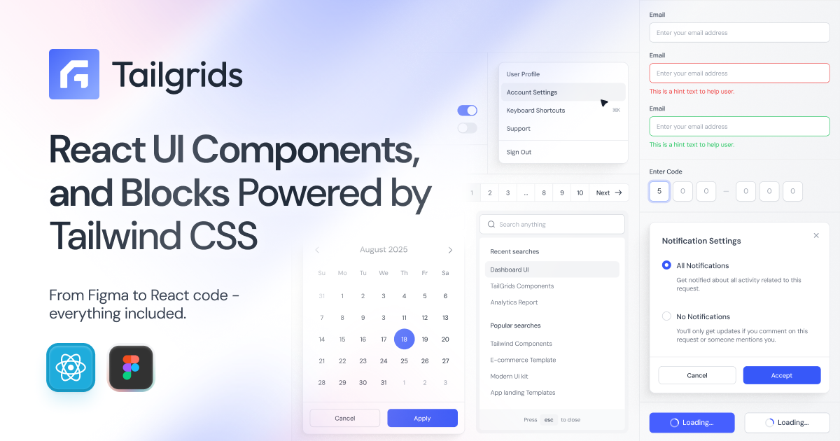
React UI Components, Powered by Tailwind CSS
A complete React component library built for production.
Ship modern web apps faster with 600+ free components, blocks, and templates in one unified React, Tailwind and Figma UI library. Built for developers and designers, optimized for performance, accessibility, and consistency. AI-workflow ready, with a full Figma design system and React UI system included.
Commercial cues
Model
hybrid
Free tier
Yes
Trial
Available
Pricing Strategy
- • A free tier offers limited components to drive upgrades to paid plans.
- • All-Access for Team adds Invite Up to 5 Team.
Operator context
Operating setup
Team
VC / larger team
LLM classification
Founded
May 2026
HQ
Bangladesh
Platform
Web app
Audience
Developers
Social footprint
Tech stack
Market demand
Tailgrids 3.0 keyword demand
5 keywords
Market demand is Starter-tier market intelligence.
Derived from this product’s latest SimilarWeb keyword mix — directional demand, not proof.
Builder Strategy
- Strategy Type
- Niche Specialist
- Stage
- Vc Growth
- Effort
- Small Team
About Tailgrids 3.0 Expand
Tailgrids UI helps developers and designers build production-ready web applications more quickly. It provides a broad set of React UI components, integrated with Tailwind CSS, and a full Figma design system.
This offering targets teams looking to reduce development time and ensure consistency across their projects. The library includes over 600 reusable components, blocks, and templates, supporting various application types, including those for AI workflows.
Its positioning as a unified product for both design and development simplifies the entire app-building process.